The Brief
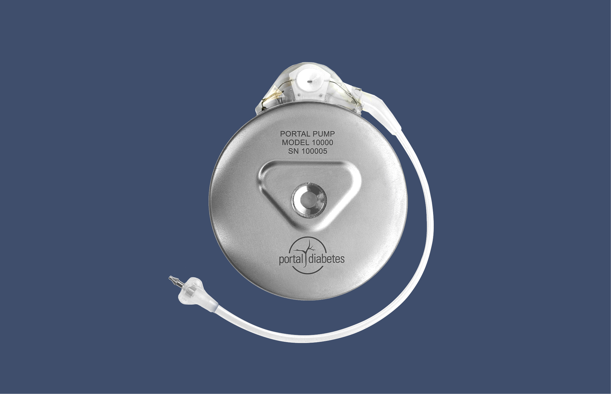
Portal Diabetes developed what they call "a practical cure for diabetes"—a fully automated, implanted insulin pump. No multiple daily injections. No constant calculations. The device handles insulin delivery automatically, learning and adapting to each person's needs.
It's a paradigm shift in diabetes management. And paradigm shifts in technology require paradigm shifts in user experience.
Automation creates new UX problems. When a device does almost everything itself, what should people see? What should they control? How do they learn to trust something they don't directly manage?
How do you design an interface for a device that's meant to disappear into the background of someone's life?
Key Challenges
Help users trust the device enough, but not too much
Enable management without inviting micromanagement
Resource users without undermining automation's promise
Master new tasks while maintaining old skills
The Work & Design
We worked with Portal from the formative stage—a field-leading competitive advantage that allowed key product decisions to be shaped by user needs and technical constraints simultaneously, rather than designing the interface after the technology was built.
Phase 1: Research & Strategy
We interviewed people with diabetes to understand their motivations, desires, and needs. We synthesized what we heard into themes around adoption, autonomy, and utility. Then we created five design heuristics to guide all decision-making:
- Long-term ambition + short-term practicality: Envision ideal solutions, but develop modularly
- Design for fully automated, prepare for manual: Include flexible degrees of manual control
- Clear mental model: Reflect how the system actually works
- Transparent reassurance: Disclose information, but don't distract
- Many paths for building trust: Give control without enabling micromanagement

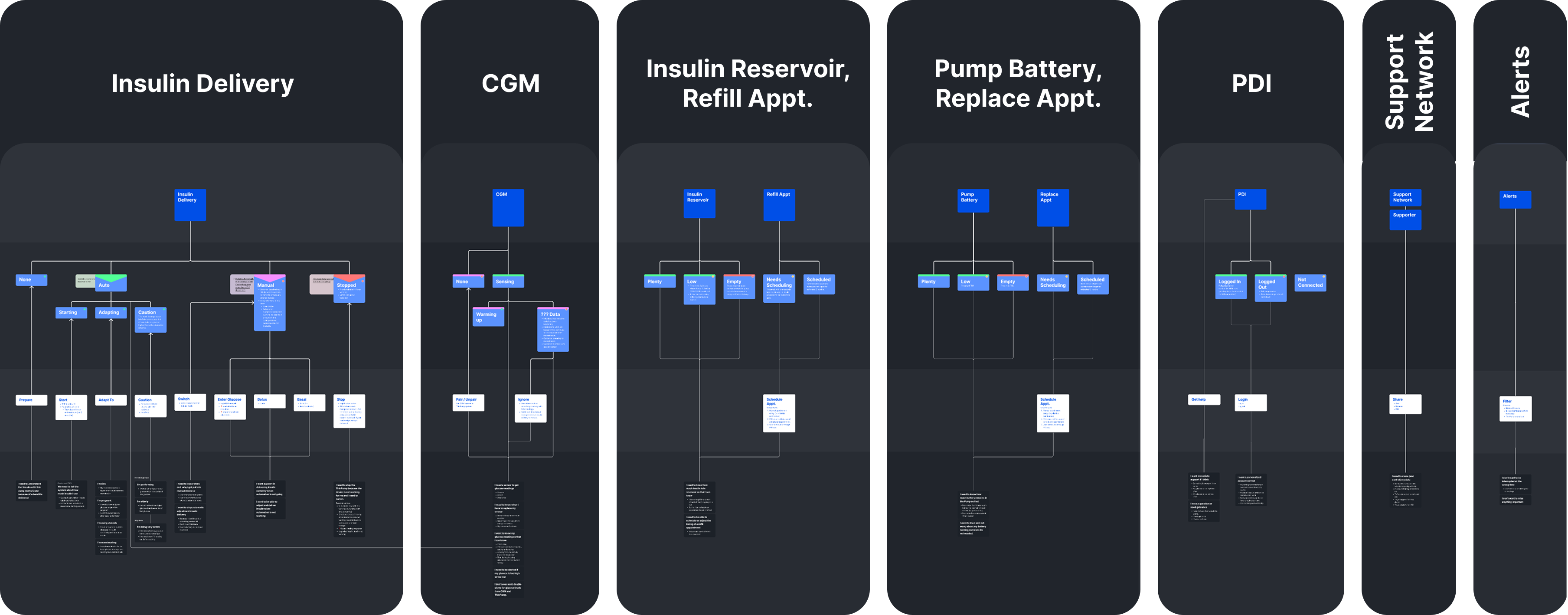
Phase 2: UX Concept Design
Over 22 weeks, we translated the strategy into a complete UX/UI system—three core screens that embody three core values:
Trust
Minimize the cognitive load of diabetes. Discourage micromanagement by cultivating the right level of trust.
Know
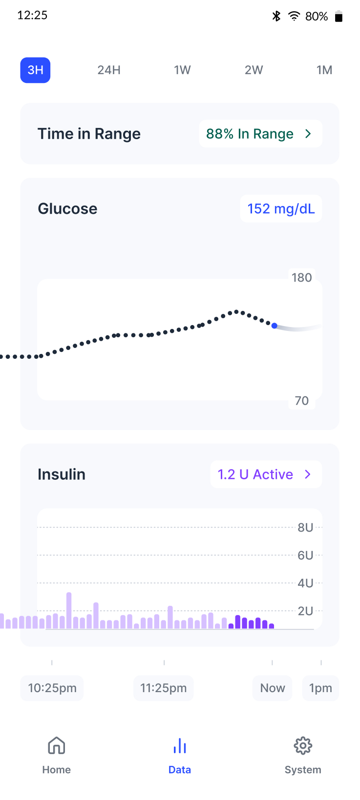
Help users understand what's happening. Show data that communicates function and value, with details when needed.
Manage
Put automation in users' hands by showcasing its value and making it transparent how to use.
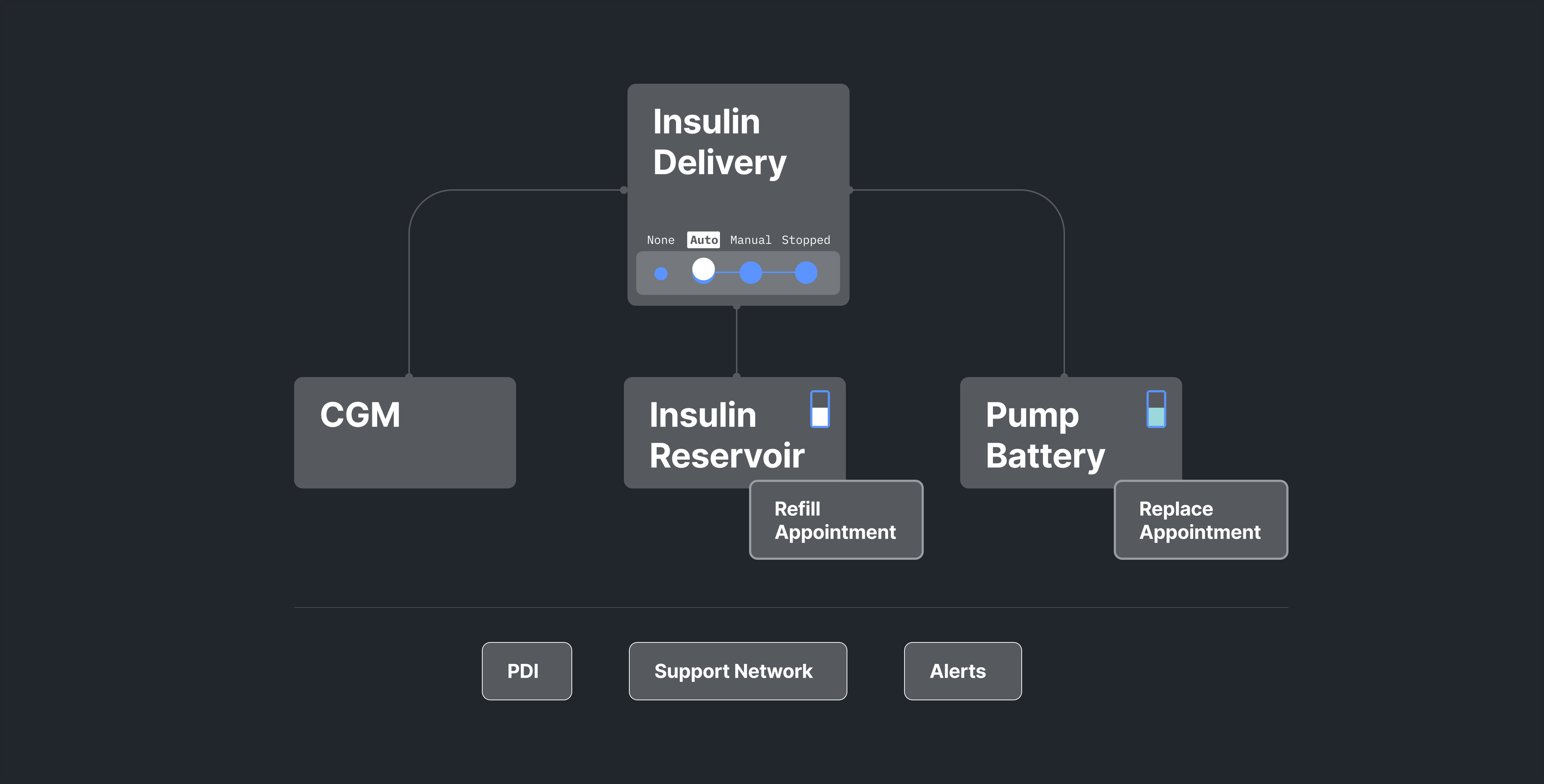
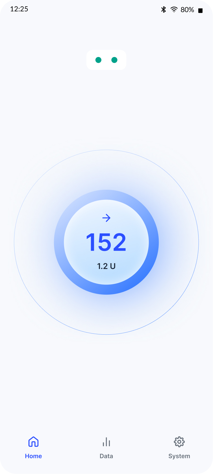
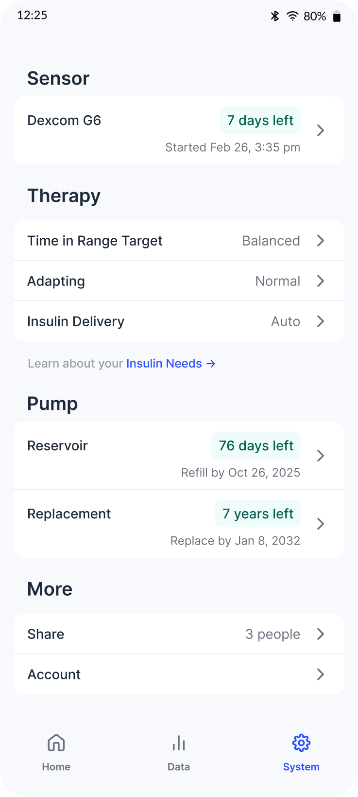
Three Core Screens
The interface centers on three screens that embody the core values of trust, transparency, and management. The Home screen provides minimal reassurance when there's nothing to do. The Data screen supports understanding through detailed insulin delivery information. The System screen offers transparent access to maintenance and settings.
The Outcome
We delivered a high-fidelity Figma prototype with implementation guidelines and research insights. The work was used as foundational research in Portal's Design History File for formative usability studies, submitted to the FDA. Portal received FDA designation to begin Phase 1 clinical trials.
Field-Leading
Design at formative stage shaped product decisions by meeting user and technical needs simultaneously
User-Validated
Recruited and managed 5 rounds of testing with ~50 people with T1D, plus 3 rounds of expert feedback
FDA Submission
Research and design used in Design History File for formative usability studies supporting clinical trials approval
My Role
As Design Director, I hired and managed a team of 4 designers and researchers, designed the overall design process, and led strategy across all three phases. I worked closely with Portal's medical and engineering teams to ensure our research and design decisions aligned with technical constraints and regulatory requirements while staying grounded in user needs.
The Team: Sara Krugman (Design Director) · Chaim Gingold (Principal Designer) · Alex Lauri (UX/UI Designer) · Bella Mariani (UX Research Support)